NFL's worst-ever uniforms, from Color Rush and throwbacks to regrettable rebrandings | FinHeaven - Miami Dolphins Forums

NFL's worst-ever uniforms, from Color Rush and throwbacks to regrettable rebrandings

DKphin

Club Member
Joined
Aug 10, 2008
Messages
14,535
Reaction score
6,353
Location
Pattaya, Thailand
5. Miami Dolphins' current uniforms

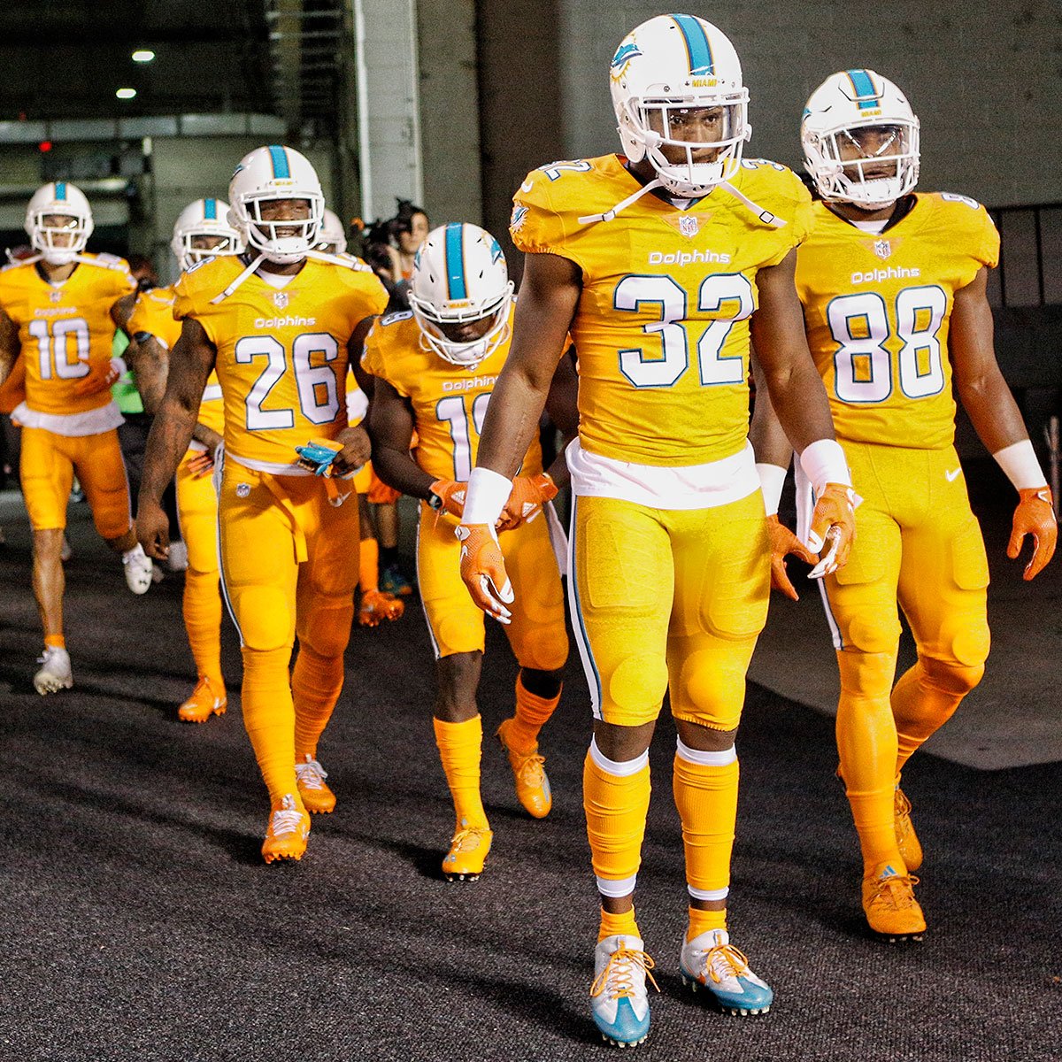
In a move that has upset nobody, the Dolphins have been wearing throwbacks more frequently lately. The new helmet-less Dolphins logo was part of a 2013 rebrand that coincided with a massive renovation of the team's stadium. For the 2019 season, the Dolphins have tweaked the look (still ugly), but will continue to wear throwbacks (still awesome).
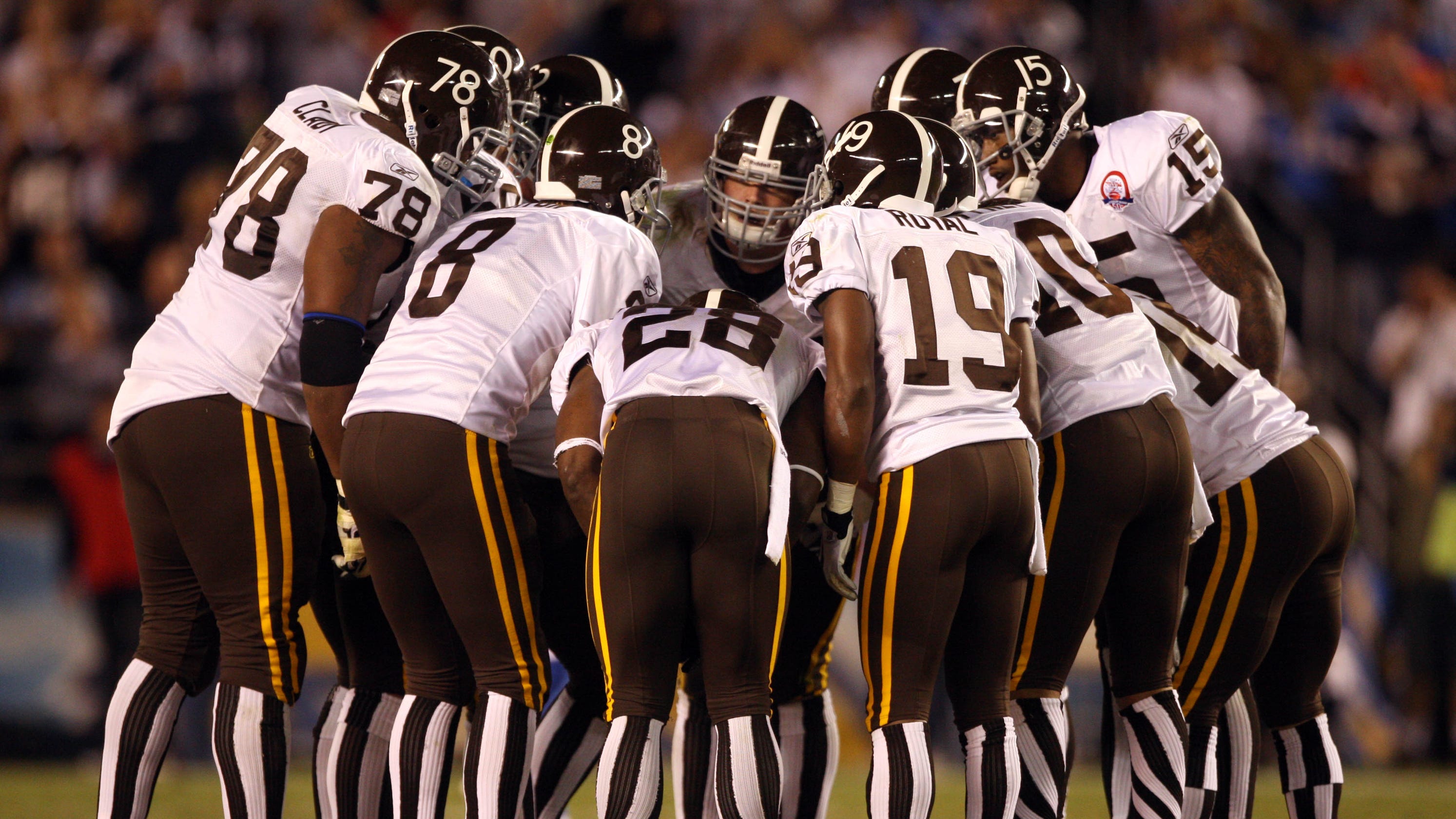

 
Wasn’t a fan of the all aqua jerseys, either. Looked like they were playing the game in their footie pajamas.
 
There you go new uniform lovers ( I’m addressing both of you) we are now ranked as the 5th worst uniform of all time. I hope Steve Ross chokes on a bag of dicks.
 
that is a mornonic list. The current uniforms are fine. Far from either all time bad or all time great.

However, this was a ****ing monstrosity:

Ctj4dOWUIAAjAjO.jpg
 
that is a mornonic list. The current uniforms are fine. Far from either all time bad or all time great.

However, this was a ****ing monstrosity:

Ctj4dOWUIAAjAjO.jpg
I was at the game for that, (Man everyone from
That team that night is pretty much gone now) everyone kept asking me why Miami was wearing Tennessee volunteer colors.
 
that is a mornonic list. The current uniforms are fine. Far from either all time bad or all time great.

However, this was a ****ing monstrosity:

Ctj4dOWUIAAjAjO.jpg
No they are not “fine” they are an embarrassment. An all time embarrassment. What we had was a classic logo, much loved and instantly recognizable. Now we have a half assed logo from a third tier rental car corporation. Maybe that’s hard to see from England, but here in Davie it’s very clear. Bottom line the logo,just like Ross needs to be tossed out
 
No they are not “fine” they are an embarrassment. An all time embarrassment. What we had was a classic logo, much loved and instantly recognizable. Now we have a half assed logo from a third tier rental car corporation. Maybe that’s hard to see from England, but here in Davie it’s very clear. Bottom line the logo,just like Ross needs to be tossed out

Who is in England?
 
I like aspects of the new uniform, but I do like the aqua color on the classics. On the television screen, the new uniforms look blue. I love the de-emphasis of orange on the new uniforms as well and the striping on the helmet. It's a cleaner look. I'd just go with the aqua from the classics.

The color splash is awful, as is the orange jerseys. Not a big fan of the all aqua either.
 
Back
Top Bottom