josephreese
Since '76
I hope you're right.That isn’t accurate. If we went to the ‘66 uniform and made our throwback the ‘90s uniform we would sell so many more jerseys over all.
I hope you're right.That isn’t accurate. If we went to the ‘66 uniform and made our throwback the ‘90s uniform we would sell so many more jerseys over all.
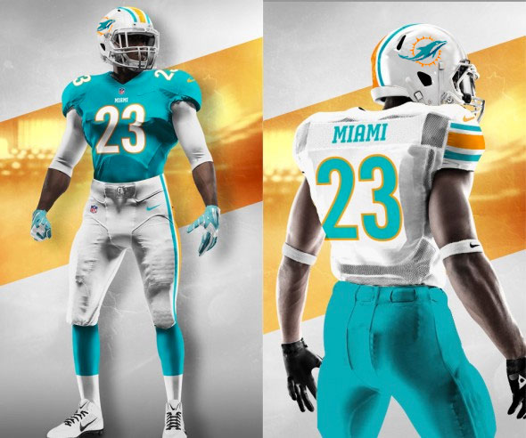
I prefer the one in your sig.I LOVE that uniform on the bottom right. More orange and no blue and stripes on the sleeve. Honestly the best outcome with our current logo/colors.
I have not purchased a single piece of Dolphins merchandise since we changed our uniforms & until they change these horrifying colors & logo I don't plan on it in the future. We need to go back to the uniforms we wore in the mid 90s.

I would love that changeHere my own wishful thinking mock-up. More orange, added stripes, gray face mask, and a darker teal. I think it would make a big difference. I LOVE the throwbacks but I also like looking forward to them on the few times they’re used. I can see them becoming commonplace if they’re made permanent.
Edit. Uploaded wrong file earlier.
The mid-90s uniforms were just bastardized versions of the throwbacks. They were uglier than the current version IMO, especially the Mickey Mouse dolphin. Plus, what exactly would they be celebrating about that uniform? First round playoff exits?
What’s to celebrate about the current logo and uniform? Irrelevance? Losing season after losing season?The mid-90s uniforms were just bastardized versions of the throwbacks. They were uglier than the current version IMO, especially the Mickey Mouse dolphin. Plus, what exactly would they be celebrating about that uniform? First round playoff exits?

As Miami is sticking with the new logo, I'd be good with the bottom right then just an opposite look with the aqua jersey (to include stripes). This is a good look and even though I love the throwbacks even better, we can still break them out twice a year.Interesting...
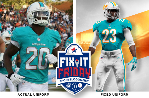
http://news.sportslogos.net/2018/02/16/miami-dolphins-making-a-uniform-tweak-in-2018/
Longtime readers of ours may remember we had a series at one point called Fix-It Friday in which we had a designer look at an existing uniform set and try to tweak it slightly to make it just a little bit better. The reason that series ended was because our designer, Brandon Moore, ended up getting a full-time design job with (you guessed it) the Miami Dolphins.
For fun, here was his proposal to tweaking the Dolphins uniform from back 2015: