OmegaPhinsFan
☠️ Banned ☠️
dolphins kill sharks? wtf are you talking aboutDolphins kill sharks. Sorry our look isn’t fierce enough for you Beyoncé.
dolphins kill sharks? wtf are you talking aboutDolphins kill sharks. Sorry our look isn’t fierce enough for you Beyoncé.

dolphins kill sharks? wtf are you talking about

Dolphins kill sharks...I think we need to be the sharks. the dolphin is a friendly mammal. we are more fierce

You are incorrect, sir.There should be a 'They all suck" option.
1966-1996 are terrible because they are poorly crafted and have the stupid *** helmet.
1996-2012 is terrible because of the awful 1990's Ford Explorer Hunter Green color and the stupid *** helmet.
2012-2018 is terrible because it looks like toothpaste
2018 - present is terrible because it still looks like toothpaste and they made orange too red.
Blend all the eras and just do the 97 one without helmet and the 66 aqua, the 74 orange and the 2012 blue:
I think we need to be the sharks. the dolphin is a friendly mammal. we are more fierce
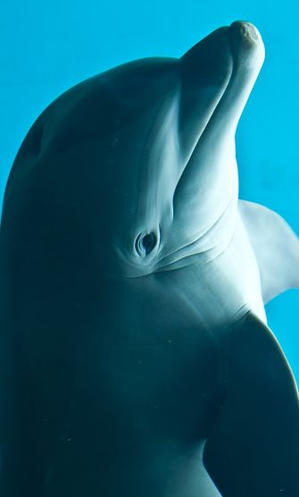
In the sea, their only enemy is the shark, but when in groups, dolphins are not afraid of sharks, and will torment and often kill a solitary shark.
Dolphins are amazingly agile and have athletic, muscular bodies that allow them to circle around a shark, dizzying and confusing it. Once the hapless shark is sufficiently stymied, the dolphins will ram the shark repeatedly with their strong snouts, delivering one heavy-weight blow after another.
dolphins kill sharks? wtf are you talking about

I'll take 2 please

Agreed. I can’t stand these. I’d take any of the retro ones over it.All I know is that the new logo is awful. I only buy retro gear it’s so bad.


